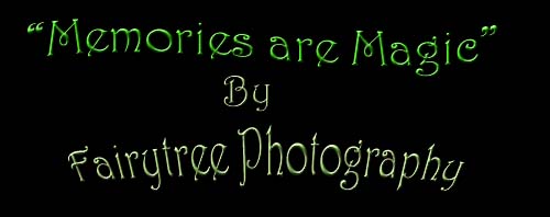
So I've been fiddling around with a new logo design for the past week or so and I think I'm ready to take it out for a test drive...
 |
| This is the original logo, that was created for Fairytree back in 2009 |
 |
| And this is the new logo idea. |
Which one sparks your interest more? Which one seems more classy, professional, and artsy? Do they both go along with the name of the company equally well? Is one more legible than the other?
I originally wanted to create something that would go good on a tshirt or hat or folder whatever marketing what have you, you can think of which is what started the new logo idea. But now that's its finished I wonder if we should just ditch the old one all together. Please let me know your opinions on this one, either here or on our facebook page.


No comments:
Post a Comment